

Taking Inventory
Fifteen cookbook covers that make and break the design grid.

Dear Readers, today we’ll admire a range of cookbook covers that make great use of a design grid. You’ll find that some designs dutifully conform to it, while others are too exuberant to be contained. Please note that this post may be too long for some email providers, but you can click the subject line to read it on the Substack website or app.
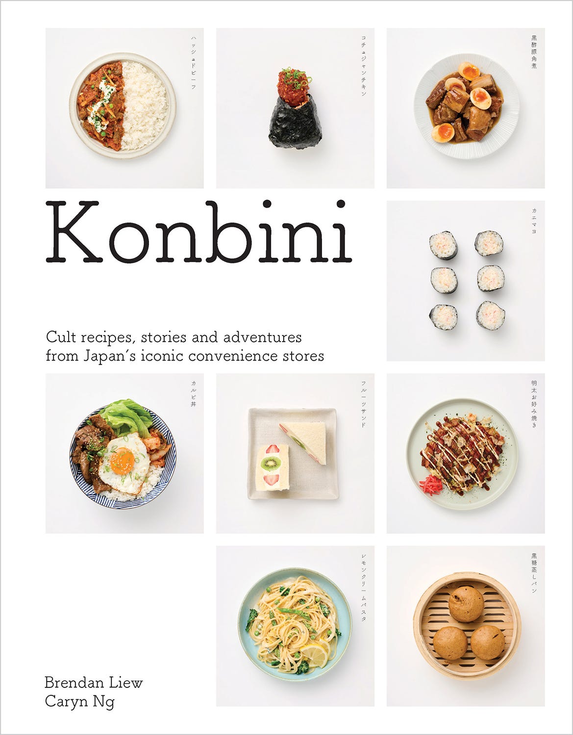
Konbini: Cult Recipes, Stories, and Adventures from Japan’s Iconic Convenience Stores
By Brendan Liew and Caryn Ng
Designed by Evi O. Studio / Emi Chiba, Evi O.
Photography by Daniel Hermann-Zoll
Food styling by Vicky Valsamis
Published by Paul McNally
Smith Street Books, Hardcover, 2024
I came across the cookbook Konbini when it was first released in 2024 and was immediately smitten. I was still savoring a recent trip to Japan—where my traveling companions and I hit Family Mart hard—so seeing several of my favorite Japanese convenience store dishes arranged so pleasingly across the cover gave me a little burst of nostalgic joy.
The tidy group of photographs, broken only by a few lines of type, got me thinking about how grids1—typically the foundation of interior book design—can also be used to bring a cover to life. In the case of Konbini, the grid seamlessly unifies several very different dishes, allowing a variety of colors, shapes, and sizes to co-exist harmoniously in one small yet critically important space.
Covers offering neatly organized, grid-based collections of things are an excellent way to pack a lot of information into a design without overwhelming the eye, and today’s post walks us through a few of my favorite cookbook covers featuring visual inventories—moving from the most rigidly laid-out designs to some of the most fluid.
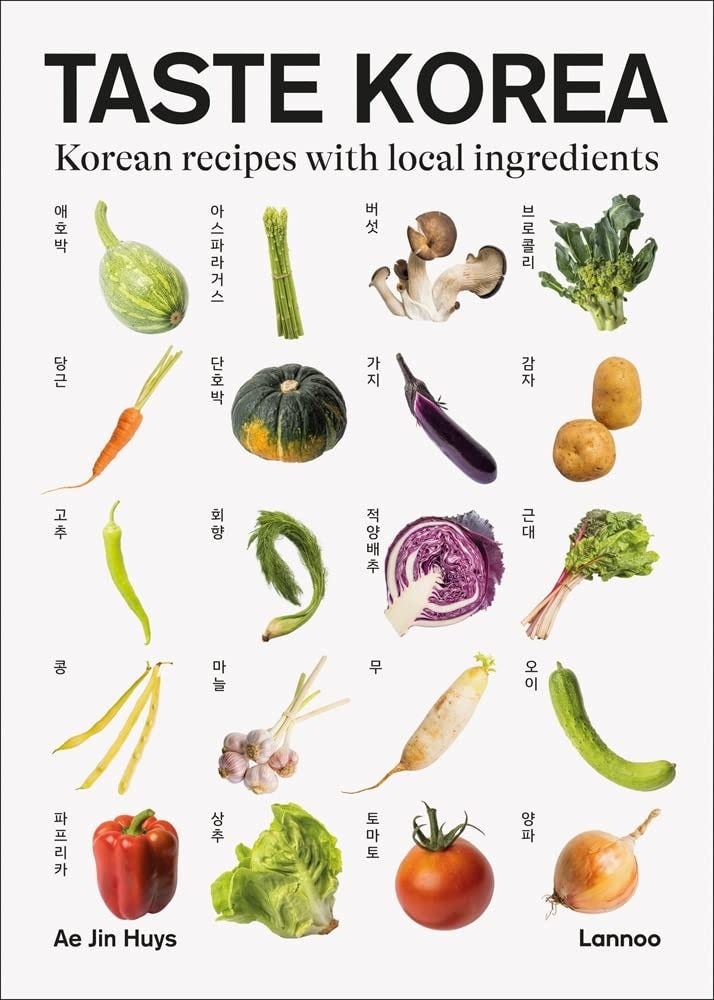
Taste Korea: Korean Recipes with Local Ingredients
By Ai Jin Huys
Design by StudioStudio.be
Photography by sustain-works
Lannoo Publishers, Hardcover, 2023
Taste Korea is a great place to start our inventory of inventories, with its straightforward modular grid. The type sets symmetrically in basic black at the top and bottom of the cover, with an orderly group of labeled vegetables in between. There’s nothing tricky happening here, but it’s worth noting that what might otherwise be a dull design is enlivened by the variety of colors and shapes in the veggies (check out that wonderful curly fennel near the center, with its luxurious fronds).
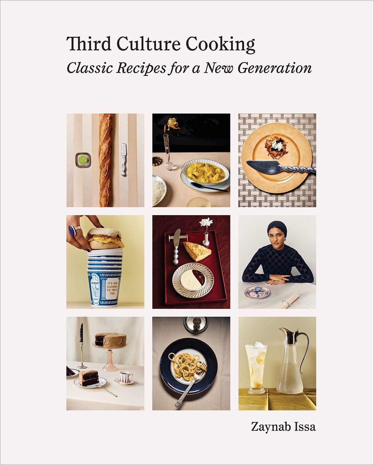
Third Culture Cooking: Classic Recipes for a New Generation
By Zaynab Issa
Design by Sebit Min
Photography by Graydon Herriott
Photography assistance by Chris Johnson and Christian Em
Food styling by Pearl Jones with Ava Chambers and Christine Quach
Prop styling by Rebecca Bertoshesky with Uma Tufekcic
Edited by Holly Dolce
Abrams, Hardcover, 2025
There is a lot vying for our attention on Third Culture Cooking’s cover: an author portrait, desserts, drinks, entrees, and even a ubiquitous NYC to-go coffee cup. If not for its tightly organized grid, this cover might descend into visual chaos. But instead, the careful balance of color, shape, and subject provides an inviting cross-section of the book’s content while making a clear statement about the author’s cultural and culinary perspectives.
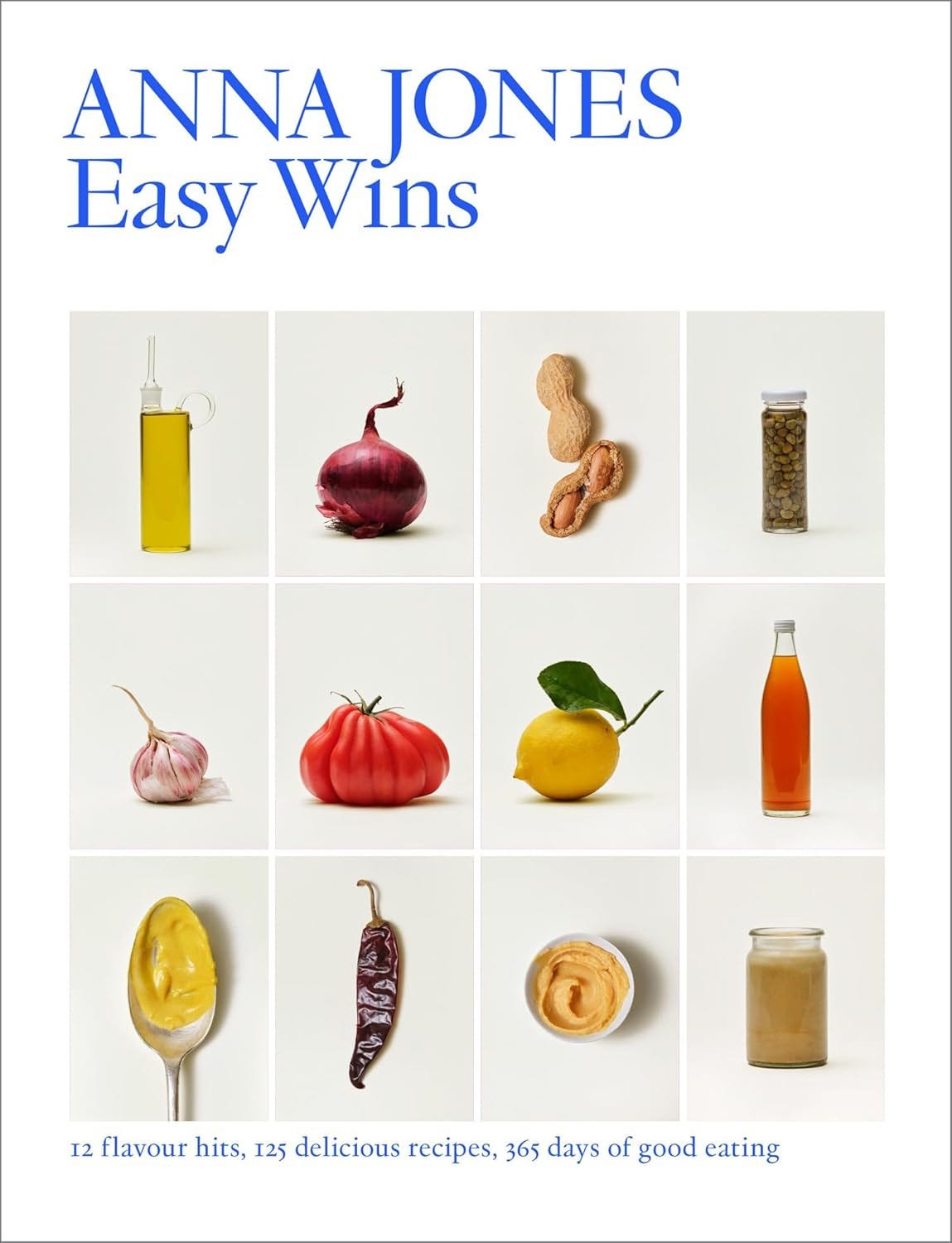
Easy Wins: 12 Flavor Hits, 125 Delicious Recipes, 365 Days of Good Eating
By Anna Jones
Design by Caneva Nishimoto
Photography by Matt Russell
4th Estate, Hardcover, 2024
Easy Wins shakes things up by setting its cover typography in a brilliant blue that contrasts boldly with the cover photographs. The uniform, understated presentation of the different fruits, vegetables, and condiments feels appealing and harmonious. I like how the idea of “365 days of good eating” is subtly reinforced by the calendar-like layout.
The Kitchen Diaries: A Year in the Kitchen with Nigel Slater
By Nigel Slater
Design by Sam Blok
Photography by Johnathan Lovekin
Viking Studio, Hardcover, 2012
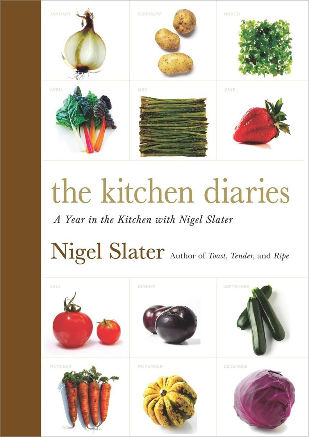
The calendar is a more obvious organizing principle on the cover of The Kitchen Diaries. The modular grid, with each box labeled by month, is bisected by a conservatively set title block. The colors and shapes of the fruits and vegetables once again keep things interesting, and the brown colorbar that interrupts the grid—pushing its contents rightward—is another unique addition to the design.2
Simple & Classic: 123 Step-by-Step Recipes
By Jane Hornby
Design by Frédéric Tacer
Cover photography by Stephen Joyce
Acquired and edited by Ellie Smith
Phaidon, Hardcover, 2019
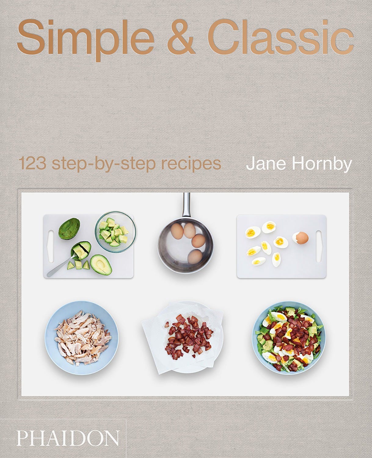
Simple & Classic distills 1233 common recipes into a few easy-to-follow steps, each accompanied by a photograph. The cover image is a montage of separate photographs that are silhouetted and dropped into a simple grid, allowing for an immediately recognizable representation of the content within. Note the perfect symmetry of the shapes in the photograph and the subtle, precise drama of the saucepan’s cropped handle. Cobb salad has never looked so easy.
Mob 6: Tasty 6-Ingredient Meals
By Mob
Design by Studio Nari
Photography by David Loftus with Jake Gauntlett
Ebury Press, Hardcover, 2024
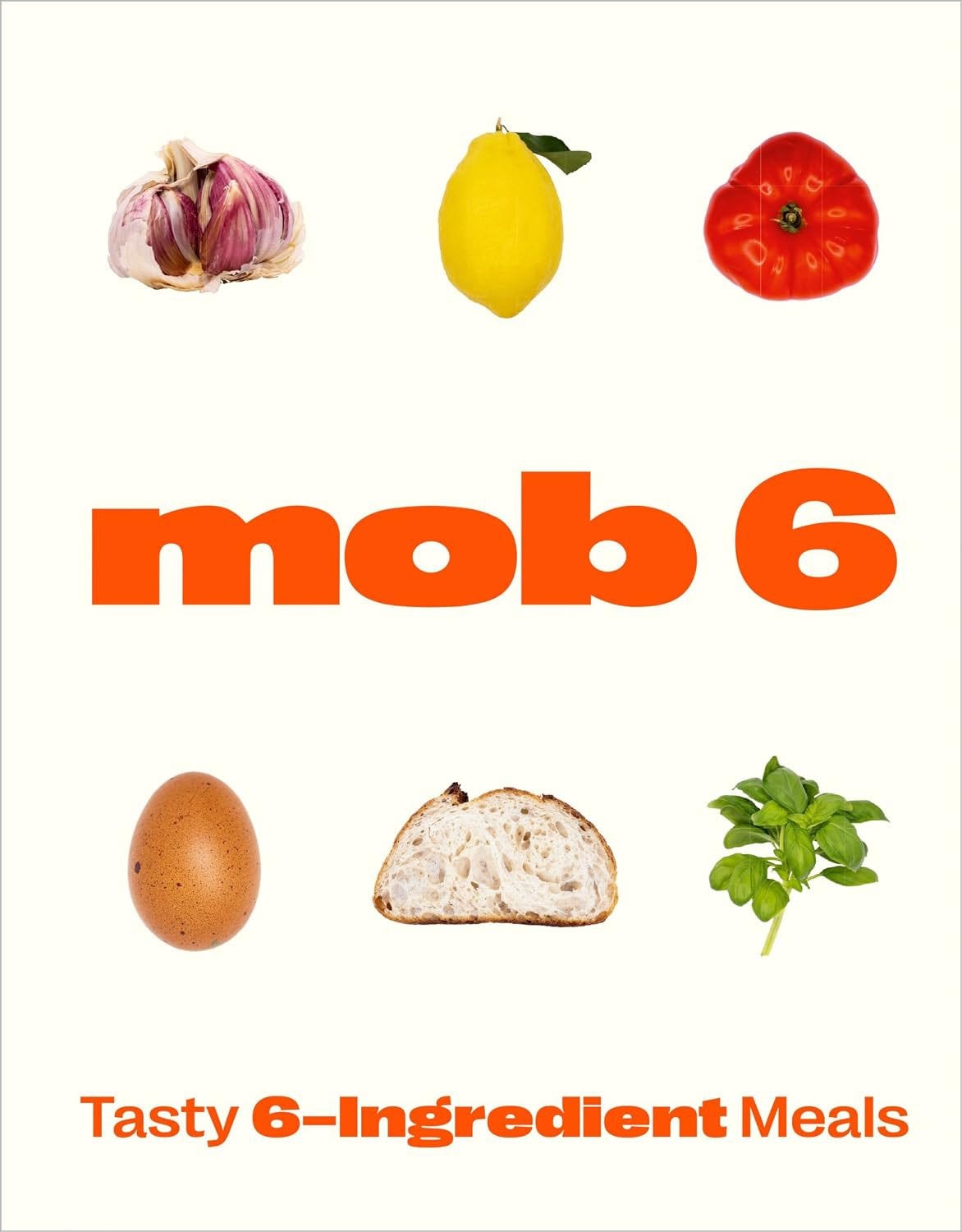
In Mob 6, the type is now getting in on the grid action. The title and subtitle alternate with the ingredient photographs and even echo their forms. I especially enjoy how the “mob 6” characters mirror, almost exactly, the shapes of the tomato, egg, bread, and garlic. Not unlike Simple & Classic, this cover tells me that whatever’s inside is clever, easy, and fun.
The Kitchen Garden: Sowing, Growing, and Cooking for the Garden Enthusiast
By Lucy Mora
Design by Ashlea O’Neill / Salt Camp Studio
Illustration by Lucy Mora
Edited by Melody Lord
Thames & Hudson, Hardcover, 2023
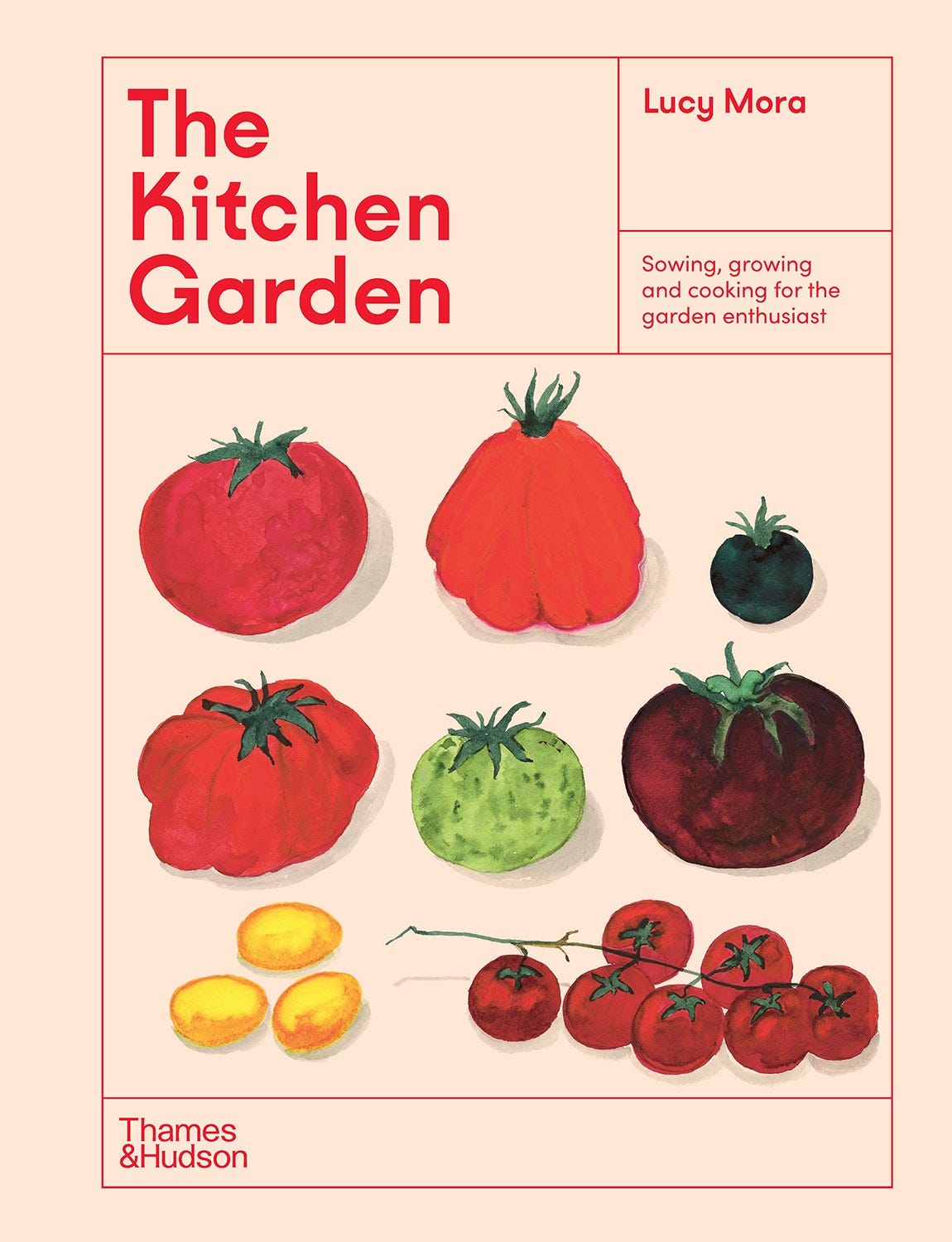
Things start getting asymmetric with The Kitchen Garden. The type—setting simply in one color and typeface—is contained within various boxes that conform to a loosely implied grid that also holds several jaunty-looking tomatoes. The larger box framing this collection of elements keeps them all in good order and makes me feel as if I’m peering down into a tidily segmented raised-bed garden.
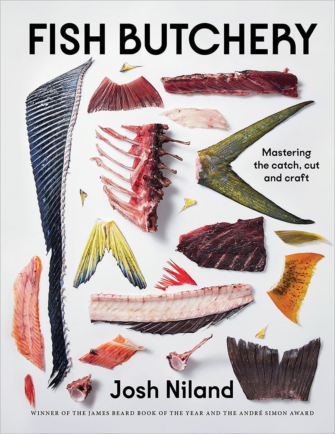
Fish Butchery: Mastering the Catch, Cut, and Craft
By Josh Niland
Design by Daniel New
Photography by Rob Palmer
Styling by Lucy Tweed
Edited by Simon Davis
Design management by Kristin Thomas
Published by Michael Harry
Hardie Grant Books, Hardcover, 2023
Although any sense of a modular grid has been abandoned on Fish Butchery’s cover, there is still a very intentional, mostly linear, arrangement of bones, cartilage, and fins. The type tucks into the fishy bits, and everything is contained within a neat rectangular composition. Here, the messy topic of butchery is treated with a degree of sensitivity and restraint that is reflective of author Josh Niland’s mastery of the craft.
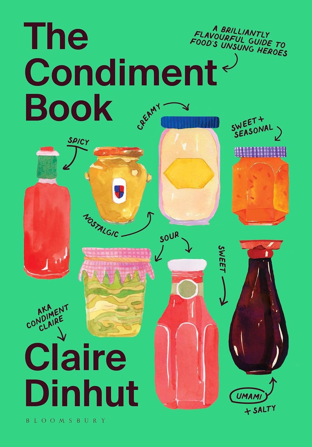
The Condiment Book: A Brilliantly Flavorful Guide to Food’s Unsung Heroes
By Claire Dinhut
Design by Evi-O. Studio / Evi O. and Eloise Myatt
Illustration by Evi-O. Studio / Eloise Myatt, Siena Zadro, and Katherine Zhang
Edited by Lucy Bannell
Bloomsbury, Hardcover, 2024
The subtle grid underpinning the various jars on The Condiment Book’s cover—you can draw straight lines across most of their caps and bases—provides a sense of order that is interrupted by the small handwritten notes winding their way between them. The design suggests that while there is breadth and authority in this book (with trusty “Condiment Claire” as our guide), the loosely rendered illustrations and their playful labels imply that it is very accessible, too.
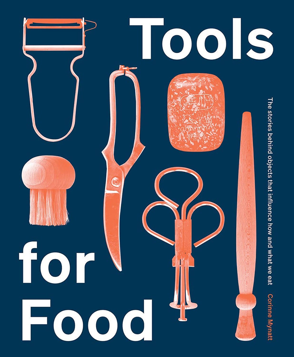
Tools for Food: The Stories Behind the Objects that Influence How and What We Eat
By Corinne Mynatt
Design by A Practice for Everyday Life
Photography by Corinne Mynatt
Hardie Grant Books, Hardcover, 2021
I couldn’t resist including the cookbook-adjacent Tools for Food in this inventory. I love the bold simplicity of the design with its collection of strange utensils that, when carefully grouped and tucked into the sober-looking typography, somehow becomes more sensible. Note the strong diagonal moving from the top left to the bottom right, pulling the eye along with it. Looking at this cover, I feel as if I’ve opened a surprise drawer of arcane tools organized in an invisible cutlery tray, and I couldn’t be more delighted by my discovery.
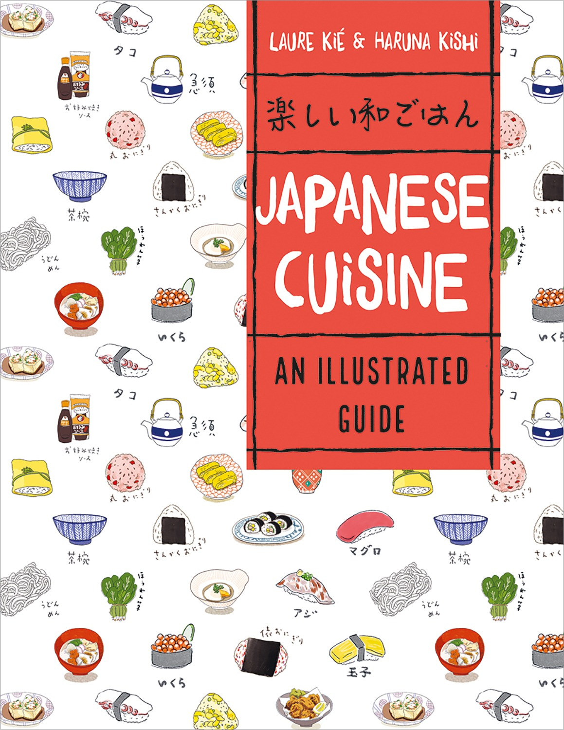
Japanese Cuisine: An Illustrated Guide
By Laura Kié and Haruna Kishi
Design by Amélie Garcin
Illustrated by Hiruna Kishi
Firefly Books, Paperback, 2021
The charming little illustrations of Japanese food and beverages hold their own against the bold red title block on Japanese Cuisine’s cover, mostly thanks to the diagonal grid on which they’re positioned. The cups, plates, and bowls march along at a 45-degree angle, giving the design a wallpaper-like uniformity while still allowing it to feel lively and dynamic.
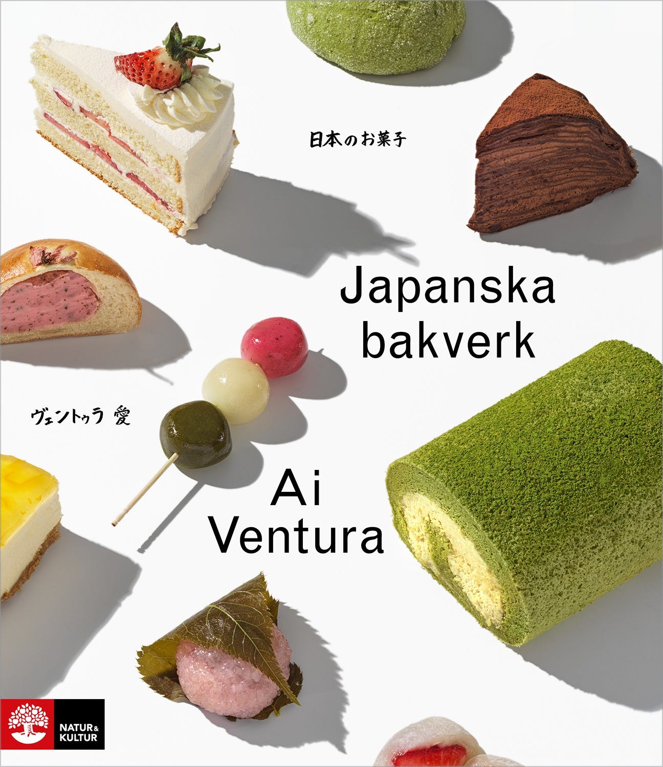
Japanska Bakverk
By Ai Ventura
Design by Sebastian Wadsted
Photography by Charlie Drevstam
Edited by Henrik Francke
Natur & Kultur, Hardcover, 2019
Continuing on a Japanese theme, we have Japanska Bakverk, a cookbook published in Swedish and dedicated to Japanese pastry. And although it would be a stretch to say that the placement of these beautiful sweets conforms to any strict grid, their diagonal arrangement—where white space plays an important role in balancing the design—helps hold their dramatically different sizes, colors, and shapes together as a group.
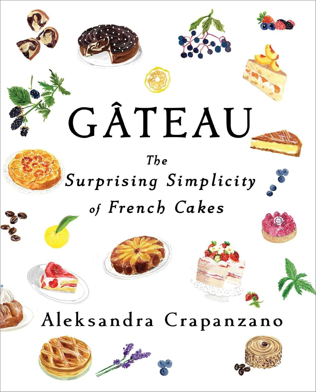
Gâteau: The Surprising Simplicity of French Cakes
By Aleksandra Crapanzano
Design by Jaime Putorti
Illustration by Cassandre Montoriol
Scribner, Hardcover, 2022
Gâteau’s cakes and ingredients hover lightly across its cover, giving this cookbook a cheerful feel. The symmetrical type provides the only anchor for the art, its strongly horizontal lines acting as a foil to the free-floating sweets. As in Japanska Bakverk, the white space plays a critical role in balancing the design and giving the cakes room to roam. Only one cake stretches outside of the picture frame, a tiny but notable departure from what is otherwise a fairly well-contained composition.
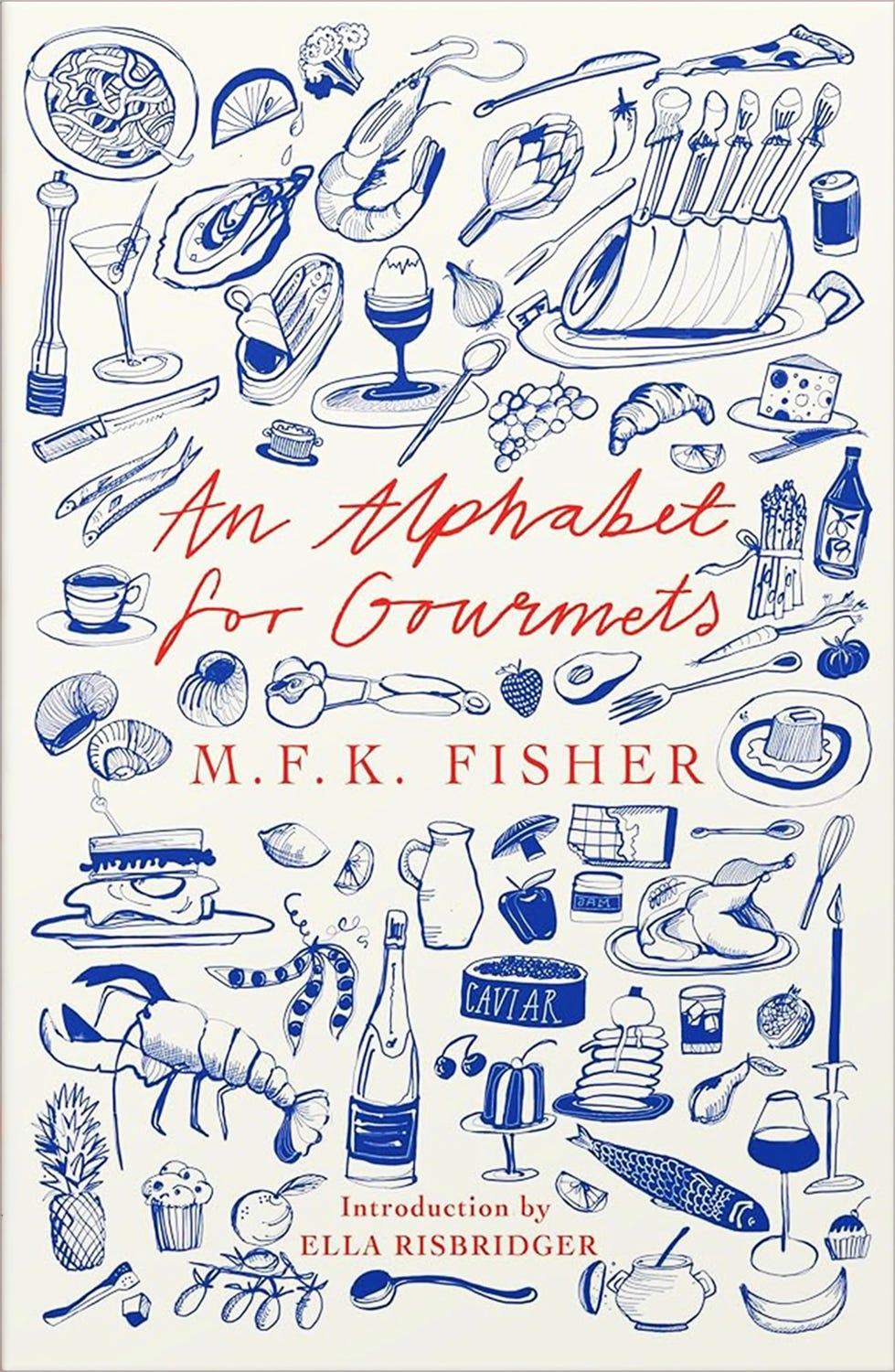
An Alphabet for Gourmets
By M.F.K. Fisher
Design and illustration by Holly Ovenden
Daunt Books Publishing, Paperback, 2022
I’m rounding out our cover inventory with the recent reissue of An Alphabet for Gourmets. The type is the only element setting on a clean line here, with a busy collection of food and beverages4 crowded around it. The design’s energy is wonderful, and I appreciate the additional pop that the blue and orange complementary color5 combination provides. And though the art almost dances right off the edges, it remains locked in place by the most enduring grid of all—the cover itself.

Thanks so much for reading, and I hope to see you back here in two weeks when we’ll meet Martin Sorge and discuss the design of his debut cookbook Great Bakes on Substack Live.
Here is a quick explanation of design grids and how they work. If you’d like to do a deeper dive on the subject, take a look at Kimberly Elam’s Grid Systems, published in 2004 by Princeton Architectural Press.
Nigel Slater’s books often feature colorbars along the left side of their covers. They don’t appear consistently enough to be a proper branded element, though the colorbars do appear on most of his Kitchen Diaries covers.
It’s a genius bit of editorial strategy that the number of recipes—123—reinforces the simplicity of this book’s approach (as in “it’s as easy as 1-2-3”).
Check out this video of Holly Ovenden creating the cover art.
Complementary colors are opposites on the color wheel. For example: blue and orange, red and green, purple and yellow. Want to make your cover really pop? Try one of those combos.
What a great roundup with such wonderful grid and organizational/structural inspiration. Thanks so much for sharing!
So Beautiful!