

Good Personalities
Ten author-centered covers that spark the imagination.

Dear readers, today’s post explores a few of the most creative personality-driven cookbook covers out there. I appreciated how quickly I could size up the unique value of each book by studying how the authors presented themselves—a clear sign of just how successful these cover designs are.
I’d also like to congratulate subscriber Gina Guilinger on winning the lovely Ways of Baking zine in the first Headnotes giveaway (and check out Gina’s interview with Sally Ekus about her indexing work)! Many thanks to those who participated. I appreciated all of your artist recommendations and follows.
Please note that this post may be too long for some email providers, but you can click the subject line to read it on the Substack website or app.
Personality-driven cookbook covers can be difficult for designers to navigate. There are often big expectations to manage—and sometimes even bigger egos—when using a face to sell a book.1 Aversion to risk is common in this situation, and frequently results in covers that shy away from more creative designs in favor of predictable visual tropes. Think: a perfectly groomed subject smiling into the camera, offering an expertly styled plate of food, in a beautifully propped, spotless kitchen. This safe, highly controlled approach seldom communicates much about what makes a book special, and tells me even less about its author.2 I prefer more messiness, more intrigue, more playfulness, and even a touch of WTF.
The following ten cover designs reject predictability, expressing personality in imaginative and exciting ways. Most of the authors are ignoring the camera, immersed in a moment of reflection, work, or pleasure. Some use humor to surprise and entertain. Others share small, captivating details to pique curiosity and draw the reader closer. But what all of these covers have in common is the promise of a compelling and unique voice, and some really delicious food.
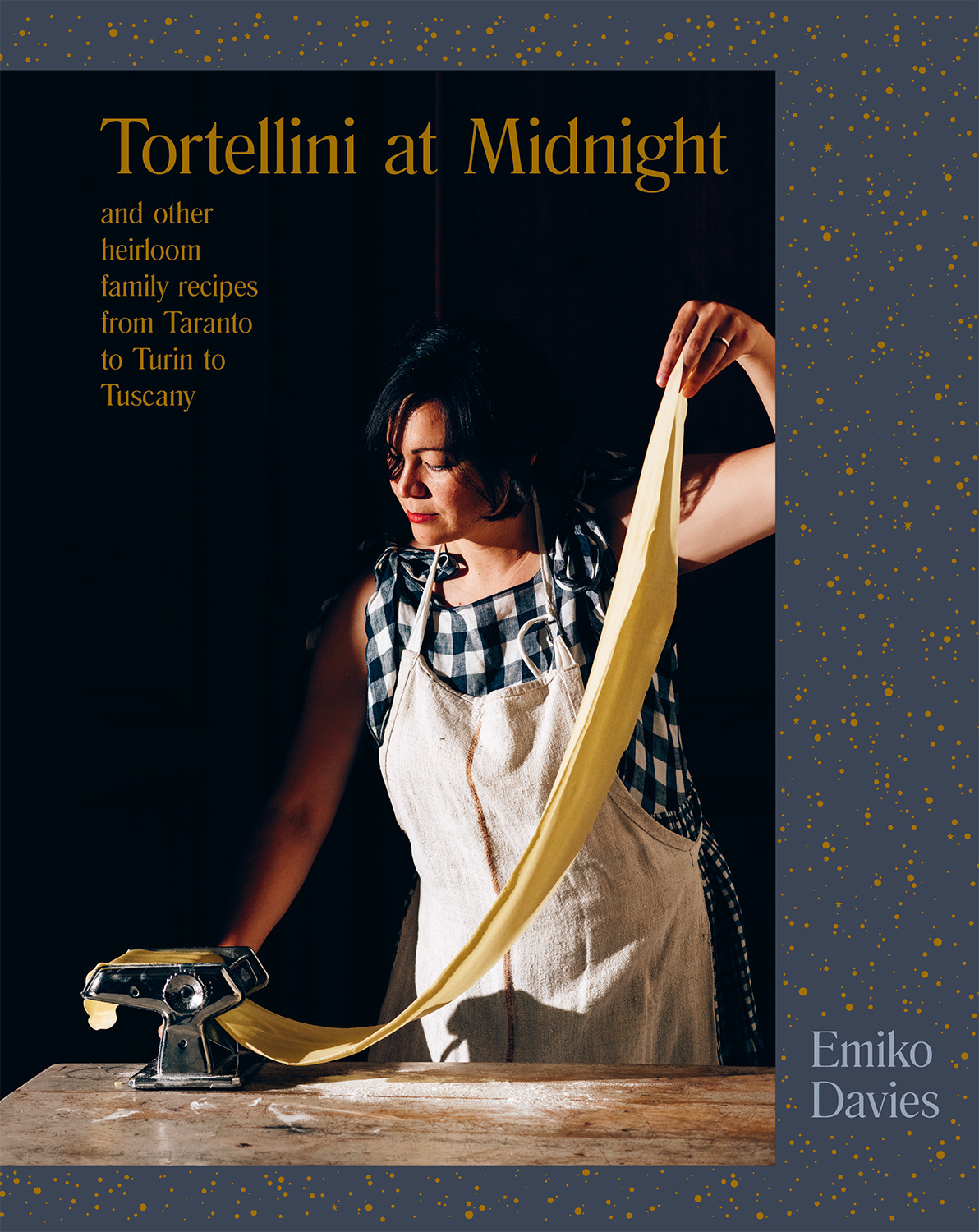
Tortellini at Midnight: And Other Heirloom Family Recipes from Taranto to Turin to Tuscany
By Emiko Davies
Design by Allison Colpoys
Photography by Lauren Bamford
Food styling by Deb Kaloper and Alice Adams (Home Economist)
Edited by Loran McDougall and Andrea O’Connor
Hardie Grant Books, Hardcover, 2019
Australian-Japanese food writer Emiko Davies pays tribute to her Italian husband’s family recipes in Tortellini at Midnight. The title refers to a small-town Tuscan tradition, started by her nonno-in-law, of ringing in the New Year with a bowl of this freshly-made pasta.
In the cover photograph—dramatically shot in chiaroscuro3—Davies recreates the late-night preparation of this festive meal. Though she is the focus of the cover, she plays it cool, averting her eyes from the camera as she looks toward the pasta machine. My eye naturally follows her gaze as it moves down her right arm to the machine, coasts along that perfect doughy arc, and around to her left arm, to rest back upon her face. This satisfying little visual loop allows me to appreciate Davies’s technique, while not fixating on her image. Instead, I look forward to the prospect of homemade tortellini, under the guidance of a skilled (and modest) cook.
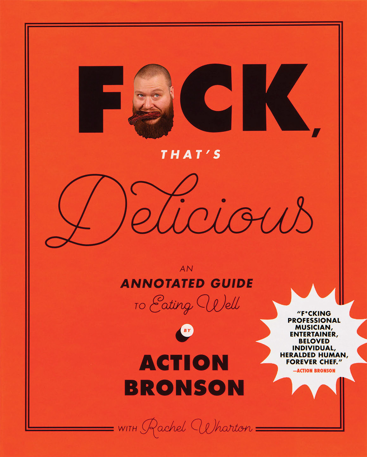
F*ck, That’s Delicious: An Annotated Guide to Eating Well
By Action Bronson with Rachel Wharton
Design by Walter Green
Creative direction by John Gall
Photography by Gabriele Stabile
Food styling by Rupa Bhattacharya and Jenna Liut
Prop styling by Nidia Cueva
Edited by Holly Dolce and Gabriel Levinson
Abrams, Hardcover, 2017
I can’t summarize rapper, chef, and TV host Action Bronson’s book F*ck, That’s Delicious any better than its product copy: “Bronson is this era’s Homer, and F*ck, That’s Delicious is a modern-day Odyssey, replete with orgiastic recipes, world travel, siren songs, and weed.”
Surprisingly, this cover features an understated author portrait. Bronson’s tiny head, chomping on a large piece of pork belly, politely recedes as it integrates seamlessly into the title. Instead of relying on his likeness to grab my attention, the typography is doing all the work. The combination of the strong sans serif and the delicate script suggests that this book is a study in contrasts, where Bronson’s brash style meets fine dining (picture Bronson at Osteria Francescana being hand-fed noodles by Massimo Bottura).
I admire this design’s restraint. The cover could have easily been over-the-top, but the designer opted for a more elegant look. And while the tone is irreverent (accented in an appropriate bright red), F*ck, That’s Delicious’s cover also feels classical with its conservatively framed, symmetrical composition—perhaps a subtle nod to Bronson’s Homeric ambitions.4
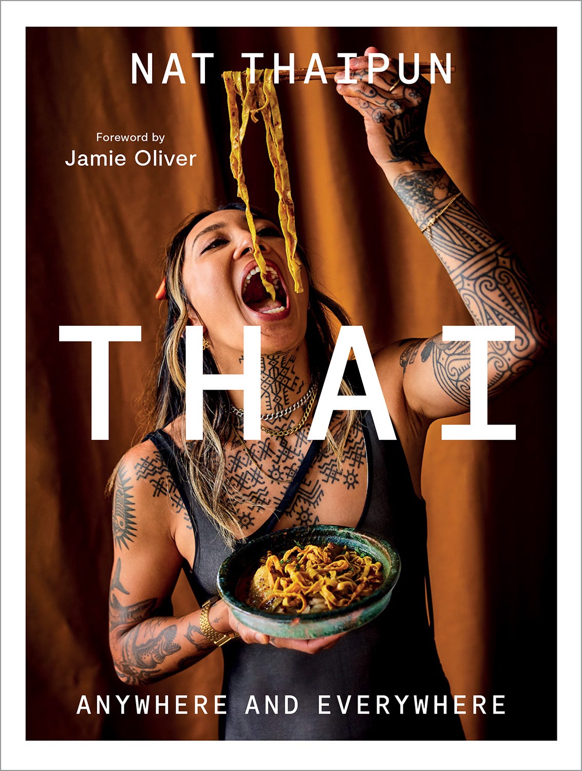
Thai: Anywhere and Everywhere
By Nat Thaipun
Foreword by Jamie Oliver
Design by Daniel New
Creative directed by Kristin Thomas
Typeset by Hannah Schubert and Daniel New
Photography by David Loftus
Edited by Antonietta Anello and Simone Ford
Food styling by Vanessa Austin and Jimmy Callaway (Home Economist)
Hardie Grant Books, Hardcover, 2025
Thai’s cover artfully captures Australian author and MasterChef winner Nat Thaipun’s description of Thai food as “untamed, wild, and deeply satisfying.”5 Her striking portrait—greedily open-mouthed and prodigiously tattooed—is eye-catching, but the tone of her skin and clothing almost blends into the background, softening the image’s fiery attitude. The large title treatment also downplays her photograph as it straddles the center of the composition, obscuring her figure. The small white frame around the cover further contains the exuberance of the image.
Thai’s tonality, typography, and framing are important cover design devices. They temper the boldness of Thaipun’s photograph and establish that, as commanding as she is, this book is not really about her, but about the simplicity and craveability6 of her food. Those gorgeous golden noodles—dangling tantalizingly in front of her—are Thai’s main attraction.
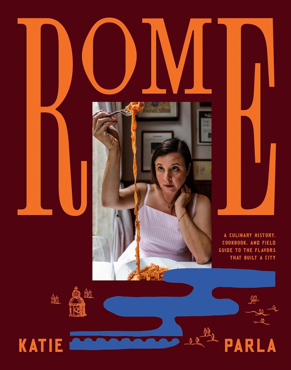
Rome: A Culinary History, Cookbook, and Field Guide to the Flavors that Built a City
By Katie Parla
Design by Ian Dingman
Photography by Ed Anderson
Parla Publishing, Hardcover, 2025
Another entry in the noodle appreciation category, Katie Parla’s Rome takes us through the evolution of Roman dining, from its early history to the present day. With its bold color palette and unconventionally proportioned type and images, Rome’s cover design signals a vibrant, fresh take on an ancient topic.
Parla is a well-known authority on Italian cuisine and, as such, might have inspired a more prominent cover portrait.7 But her small photograph on Rome’s cover is a brilliant design move: it resembles a perfectly proportioned little window tucked into the architectural typography, offering a peek into a Roman dining room. In it, we observe Parla in her element, projecting focus, ease, and a healthy appetite.

Heston Blumenthal at Home
By Heston Blumenthal
Design by Graphic Thought Facility
Photography by Angela Moore
Styling by Lesley Dilcock
Bloomsbury, Hardcover, 2011
I don’t think I’ve seen a more ambitious midnight snack than the one that Michelin-starred English chef and restaurateur Heston Blumenthal is procuring from his fridge in Heston Blumenthal at Home. But I wouldn’t expect anything less from a man widely regarded as one of the most innovative chefs working today.
In this book, Blumenthal leans into his trademark technical approach to food, offering precise yet easy-to-follow recipes. The dramatic lighting and his intense concentration set a serious tone, yet his collection of colorful everyday ingredients—some haphazardly wrapped in plastic and foil—brightens the mood. Blumenthal may have spent the day pushing the culinary envelope at The Fat Duck, but tonight he’s bringing that same degree of focus to preparing a simple and delicious home-cooked meal.

Try This at Home: Recipes from My Head to Your Plate
By Richard Blais
Foreword by Tom Colicchio
Design by Laura Palese
Photography by John Lee
Edited by Emily Takoudes
Clarkson Potter, Hardcover, 2013
Try This at Home’s cover features one of the most masterful pictogrammatic-like devices that I’ve seen on a cookbook cover: restaurateur and Top Chef winner Richard Blais literally inserted into the book’s typography, a clever stand-in for its subtitle.
The Surrealist in me enjoys the comically cannibalistic scenarios that Blais’s head—lightly peppered, mildly bewildered, and resting on a plate of culinary foams—conjures. Aside from being wickedly memorable, Try This at Home’s cover is successful as it immediately communicates exactly what the book delivers: fun, inventive recipes from a chef who doesn’t take himself too seriously.
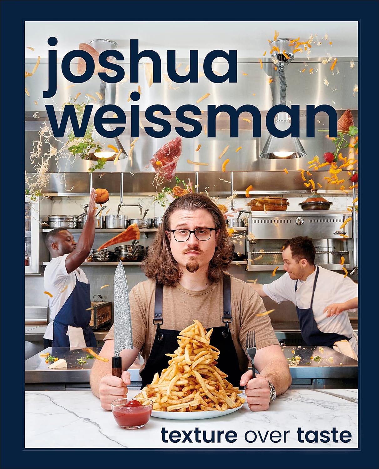
Texture Over Taste
By Joshua Weissman
Art and design direction by William Thomas and Rebecca Batchelor
Photography by Ralph Smith Studios
Photo art direction by Joshua Weissman
DK, Hardcover, 2023
Texture Over Taste wins me over immediately with a daring, irresistible combo: a chest-high pile of golden French fries and a food fight. Chef and popular YouTuber Joshua Weissman uses humor to get his points across in this book, which explores fundamental food textures as the gateway to culinary nirvana.
On Texture Over Taste’s cover, Weissman looks calm, grounded, and confident—despite the threat of getting side-swiped by a slice of pizza. His name, casually set in lower case, dominates the composition and further reinforces both his authority and his informality. Eyebrow cocked and formidable chef’s knife at the ready, he embodies his book’s promise to “make cooking what it’s supposed to be—lots of fun…and maybe even a little dangerous!”8
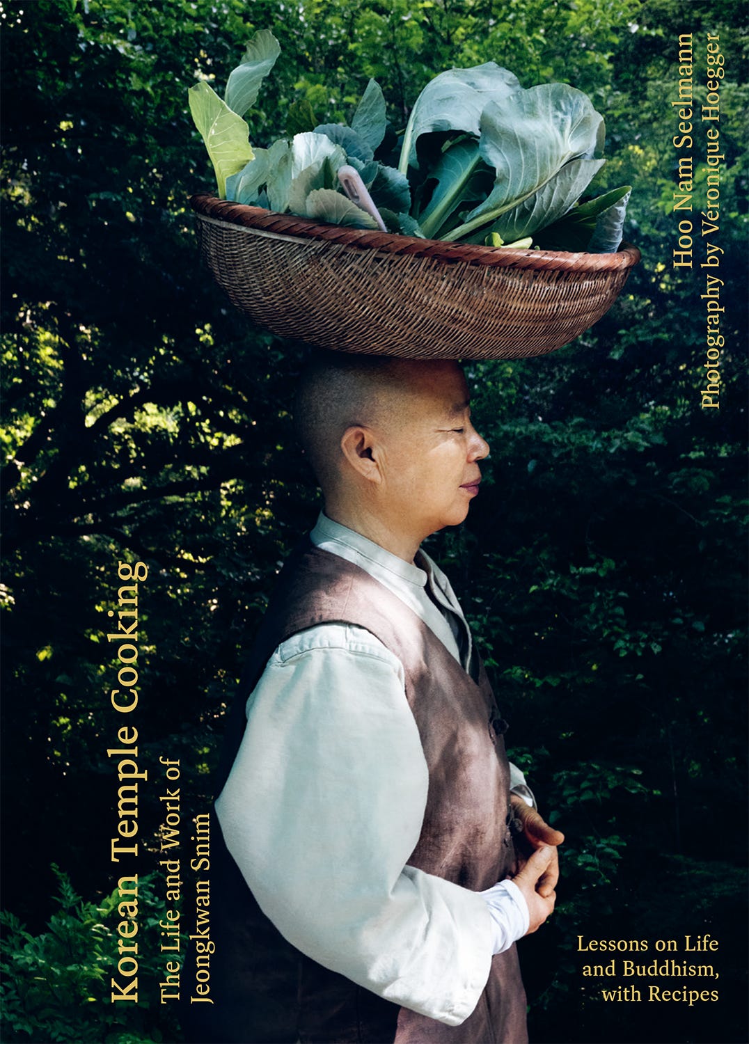
Korean Temple Cooking: The Life and Work of Jeongkwan Snim
By Hoo Nam Seelmann
Designed by Müller+Hess+Walter+Wyss
Typeset by Hadley Hendrix
Photography by Véronique Hoegger
Hardie Grant Books, Hardcover, 2025
Korean Temple Cooking’s cover is an excellent expression of its subject, Buddhist nun Jeong Kwan,9 and her wholesome temple food recipes. Kwan, looking serene as she balances a large basket of leafy produce on her clean-shaven head, appears oblivious to the camera, faintly smiling in a moment of silent reverie (perhaps imagining her next meal).
This design is a wonderful visual metaphor for the concepts of balance and mindfulness that are fundamental to both Buddhist practice and Kwan’s cooking. And though she may be the star of this show, Kwan’s humility on this cover beautifully reflects the notions of simplicity and deep spiritual connection to nature that Korean Temple Cooking explores.
Food You Want to Eat
By Thomas Straker
Design by Luke Bird
Photography by Issy Croker
Styling by Kitty Coles
Edited by Lucy Bannell
Bloomsbury, Hardcover, 2025
The cover of English chef and restaurateur Thomas Straker’s Food You Want to Eat is quiet and elegant. The meal is refined, the lighting is soft, and the white tablecloth is pristine. Straker has a bit of a bad-boy reputation, but the only hint of mischief here is the bleached-blond spiky hair topping his conservative sweater-and-collared-shirt ensemble.
Straker aims to break down the barriers between professional and home cooking in Food You Want to Eat, and we get a sense of that rebellious spirit in his casually irreverent coiffure—like a note of punk rock in an otherwise classical composition. But the most compelling clue to this book’s accessibility is the empty place setting in the foreground, beckoning the reader, whoever you might be, to take a seat and dig in.
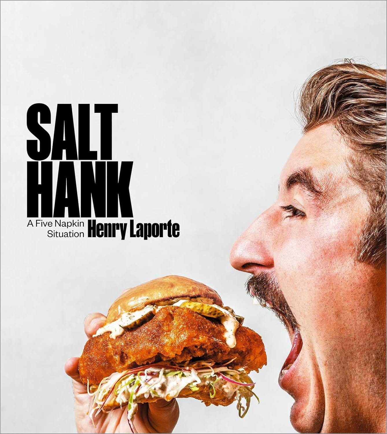
Salt Hank: A Five Napkin Situation
By Henry Laporte with Ann Volkwein
Design by Laura Palese
Photography by Ed Anderson
Food styling by Lillian Kang and Paige Arnett
Simon Element, Hardcover, 2024
Photographs of authors eating with their mouths wide open are generally avoided on cookbook covers, but Salt Hank pulls off this immodest pose in a way that feels appealing and true to author Henry Laporte’s playful online persona. Laporte, better known as “Salt Hank,” rose to internet fame through his viral cooking videos on TikTok and Instagram. But that fame didn’t go to his head on this cover. On the contrary, his head is secondary to the large, crispy, and delicious-looking sandwich that he’s about to sink his mustache into.
Salt Hank’s cover photograph is smart. It downplays the impending messiness of Laporte stuffing his face by allowing that ostentatious sandwich to take center stage, while he—in a moment of gluttonous glee—is shot in profile. The image reinforces that, though Laporte is here to entertain, this book is all about the food.

Thanks for reading, and I hope to see you back here in two weeks when we’ll meet a British designer whose illustrated cookbook covers will knock your socks off.
I won’t break down all the factors that go into producing personality-driven covers—especially for more well-known authors—since there are too many to discuss here. But trust me, it’s complicated.
This strategy has been deployed for years among the giants of cookbookery (Edna Lewis, James Beard, Julia Child, Martha Stewart, Ina Garten, etc.), and lately among celebrities and influencers, with enormous success. However, I would argue that these books do not sell because of a compelling cover design, but because the authors are beloved by their audiences—they’ll buy their books no matter how creative (or not) the covers are.
Chiaroscuro is an Italian term that refers to the dramatic contrast between light and dark that creates depth and drama, typically in a painting. I look at Tortellini at Midnight’s cover and think of Caravaggio’s St. Matthew and the Angel (1602), with those exquisite angelic robes draping like Davies’s curtain of freshly-stretched pasta dough.
Fun fact: Bronson’s favorite cookbook is Joyce Goldstein’s Mediterranean the Beautiful Cookbook: Authentic Recipes from the Mediterranean Lands. He says, “I laugh at how big and how weird it is, the long title, and how the book is about a foot and a half tall. Joyce Goldstein knows her shit on this region, the source of many of the best flavors in life.” From F*ck, That’s Delicious, page 112.
From the Introduction to Thai: Anywhere and Everywhere, page 13.
“Craveability” is not a word according to Webster’s, but I’m making it one today in Thaipun’s honor.
Parla started her own publishing company in 2022, Parla Publishing, and as such could have given herself a much larger portrait on Rome’s cover (Sales and Marketing can’t veto you when you’re the boss). I applaud her humility and her trust in good design.
Quoted from Texture Over Taste’s back cover copy. Weissman also provides the following disclaimer on the back cover: “Don’t worry! No food was wasted in the making of this image. Everything was donated to local farms to support their sustainable agricultural practices and feed their animals.”
In the subtitle, “Snim” translates to “Master” or “Monk,” and is a sign of respect. Chef’s Table fans will remember Kwan from season 3, episode 1. This video offers a nice peek into her world.
Such a great read. And so much pasta!
Great selections and analysis! I bought that Blumenthal book a few months ago for a few reasons, but mostly because I thought it was the coolest cover I’d seen in a while.